


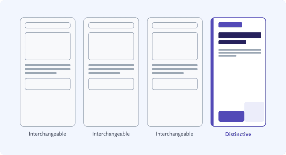
Open your email inbox right now and you’ll see a sea of sameness. Same centred logo, same hero image, same button, same everything. Email lacks the tools of many other marketing channels, with much more restricted CSS or custom anything. But we believe boring email designs aren’t a failure of the medium – they are a failure of nerve.
A more restricted toolbox should force sharper thinking. Those bold enough to imagine the channel’s constraints as the brief, rather than the enemy, can begin to design emails with more intention, impact, and personality.
Know the walls before you paint them
Every constraint in email narrows your options, and narrowing options is what turns a design choice into an actual decision. The big ones:
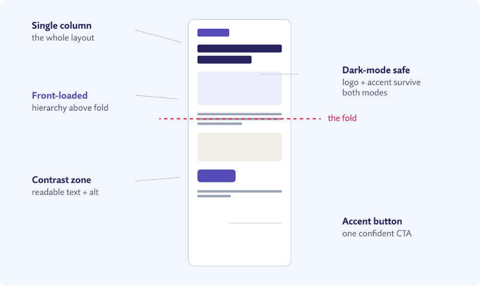
- Client rendering quirks. Outlook still runs on a Word engine, Gmail clips long emails, and CSS support is a patchwork. Your design is only as good as its worst rendering client.
- The fold. The preview pane and first screen do the heavy lifting. Front-load your hierarchy or lose the reader.
- Load and image weight. Heavy, image-dependent emails get punished by slow connections and image-blocking clients alike.
- Accessibility. Semantic structure, alt text, contrast, and readable sizing are requirements in many countries, and can make everything clearer.
- Dark mode. Colours and logos invert unpredictably, so your design has to survive both modes.
Getting creative inside the limits
Personality in email comes from a handful of reliable levers, used with intent. Three are most critical.
Colour
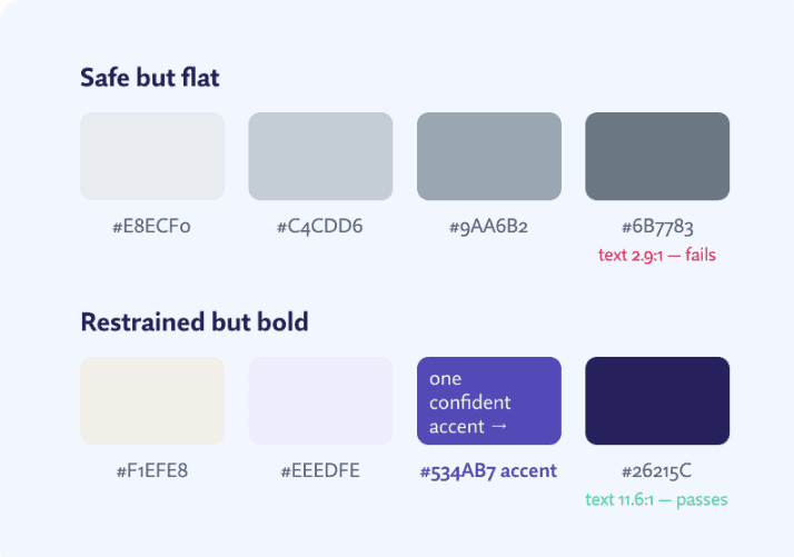
Palette carries personality more reliably than any image ever will. Build a tight set, commit to one confident accent, and treat contrast as both an accessibility requirement and an expressive tool. Check how your colours behave in dark mode before you ship. A restrained, distinctive palette reads as intentional and premium.
Typography
Email-safe fonts are bulletproof. Web fonts are richer but need intentionally designed fallbacks. Build hierarchy through size, weight, letter spacing, and case. Again, email’s constraints should push you to use type better: dramatic size jumps, confident headlines, generous line height. A strong type system does more for personality than any decoration.
Whitespace
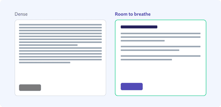
It’s free, it renders everywhere, and it signals confidence. Use intentional spacing and short blocks to set the pace. Generous space is the cheapest premium-feeling move you have.
The lighter levers
A few more are worth reaching for.
- Simple data visuals. A clean bar chart, a big-number stat, or a progress-style callout communicates fast and adds interest, as long as it’s image-light or built from styled table cells with alt text. Across our real projects the lesson repeats: a clear stat beats a decorative graphic every time. Data can be the visual.
- Unicode symbols. Arrows, checks, stars, dividers. They render natively, need no image loading, and add texture for almost nothing. Just mind accessibility and cross-client display.
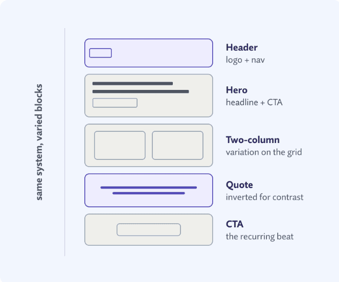
- Modular blocks. Design reusable, stackable sections, then vary them to create rhythm instead of monotony. Consistency in the system, variety in the expression.
The inbox is a level playing field
With email, everyone works inside the same limitations. That means craft and conviction can win, not budget.
So pick one lever on your next send. Palette, type, or whitespace. Push it further than feels comfortable and see what happens.